SpaceCatch
brand
guidelines
These guidelines are designed to create a cohesive and consistent visual identity across all touchpoints of our brand. Whether you're working on in-game visuals, marketing materials, social media content, or web design, this guide provides the essential rules and examples to ensure our brand always looks and feels unified.
Our aim is to inspire creativity while maintaining brand consistency, making it easier for everyone involved to align on how we represent ourselves to the world. Let’s keep our brand recognisable, memorable, and engaging across every platform!
> USEFUL LINKS <
Get inspired by HUDs&GUIs from sci-fi movies and games alike.
Zalgo generator to generate g̵̡̘̻͍͓̪̮̤͂̆̋͆̆͐͋͆̌̚͝͠l̷̢̢̳̦̞̭̰͖̀̈́̑̑̇̋͝͠͠ͅî̸̧͉̪̩͉̑͑͊͋̈́̕͜͠ţ̶̡̣̗̻̪̤̰̞̤̙̜͇̗̗̆̒̐̍̔̐͘͝c̶͎͙̻̹̬̋̃̀͒̊̐̔͋́͝h̵̛̗̪̝̟̭͇̦̺̤͈͚͇̮̣̞̓̓̎̽͝ỹ̴̻͍̘̊́̃ text.
[01] Logo

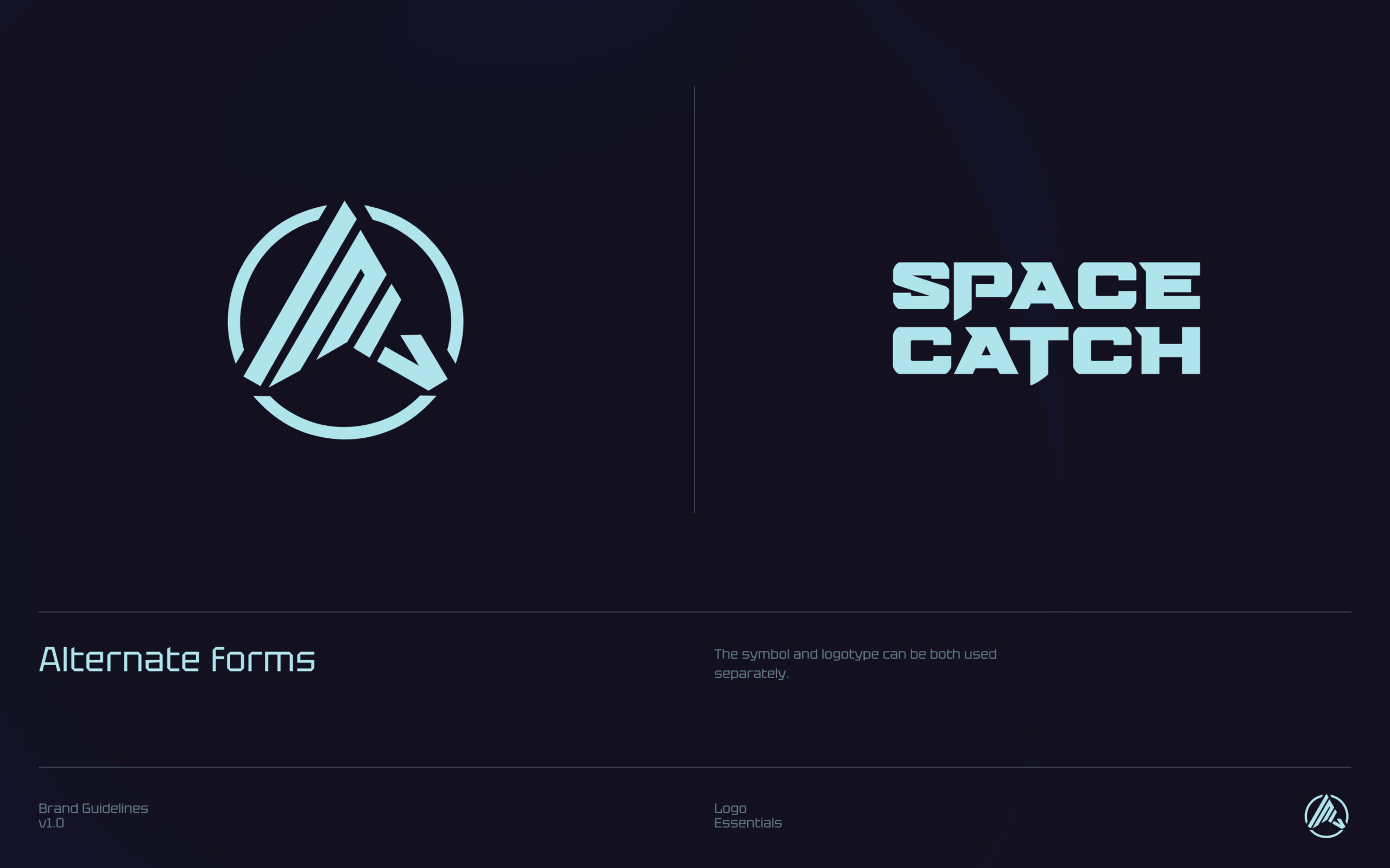
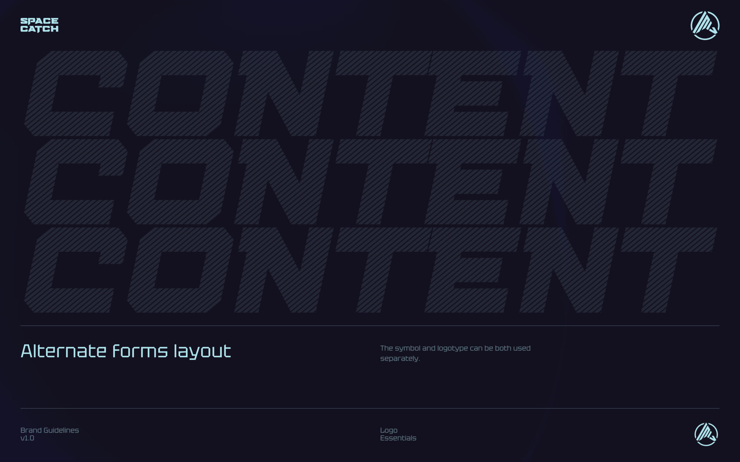
In general, try to use the logo idealy in a sequence – the first time you introduce it to your viewer, use the full format.
Second and other times, find a way how to integrate the logo or symbol into your layout, so that it serves just as a badge or a reminder.
[02] Typography
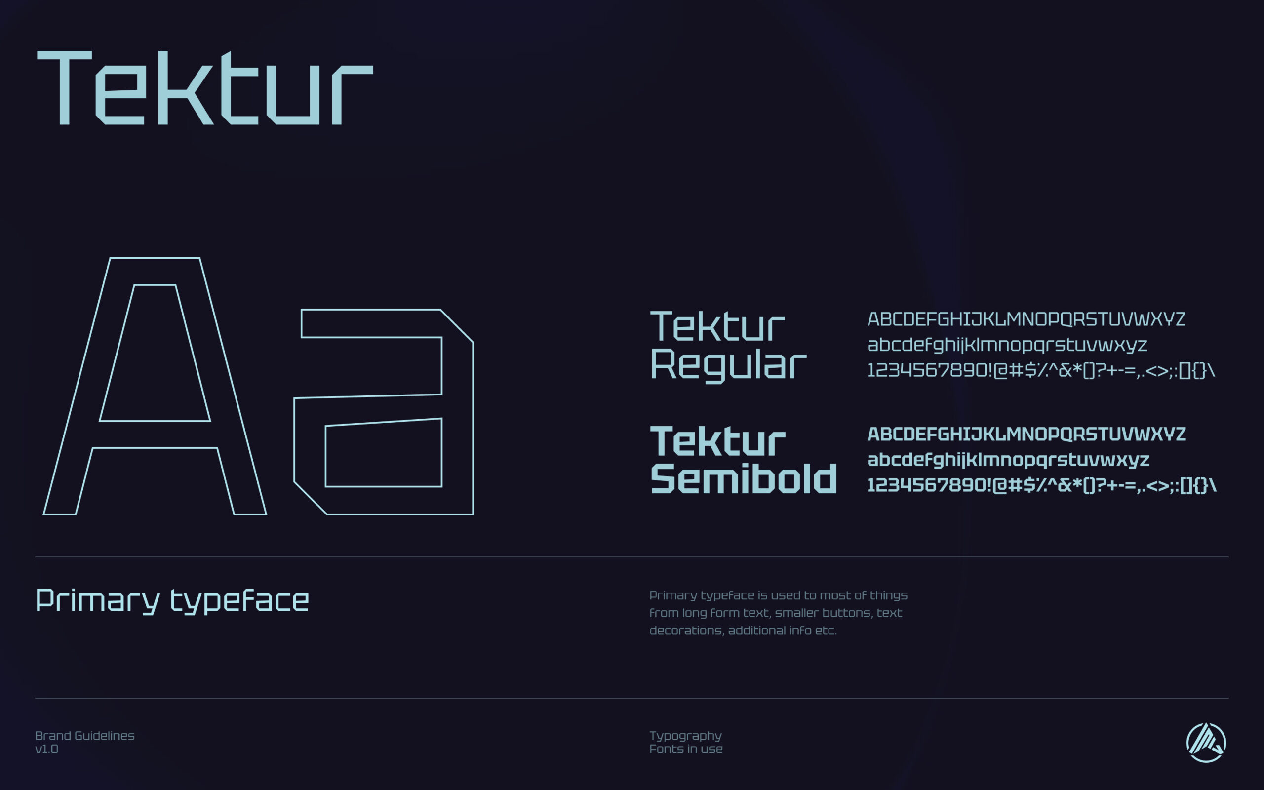
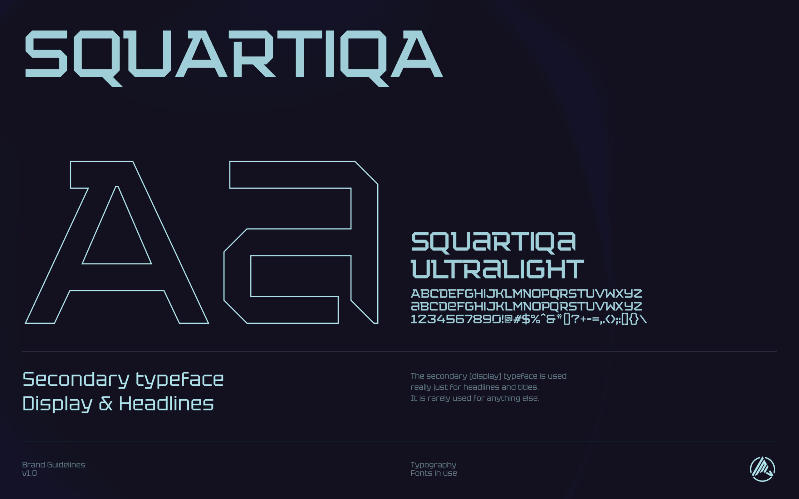
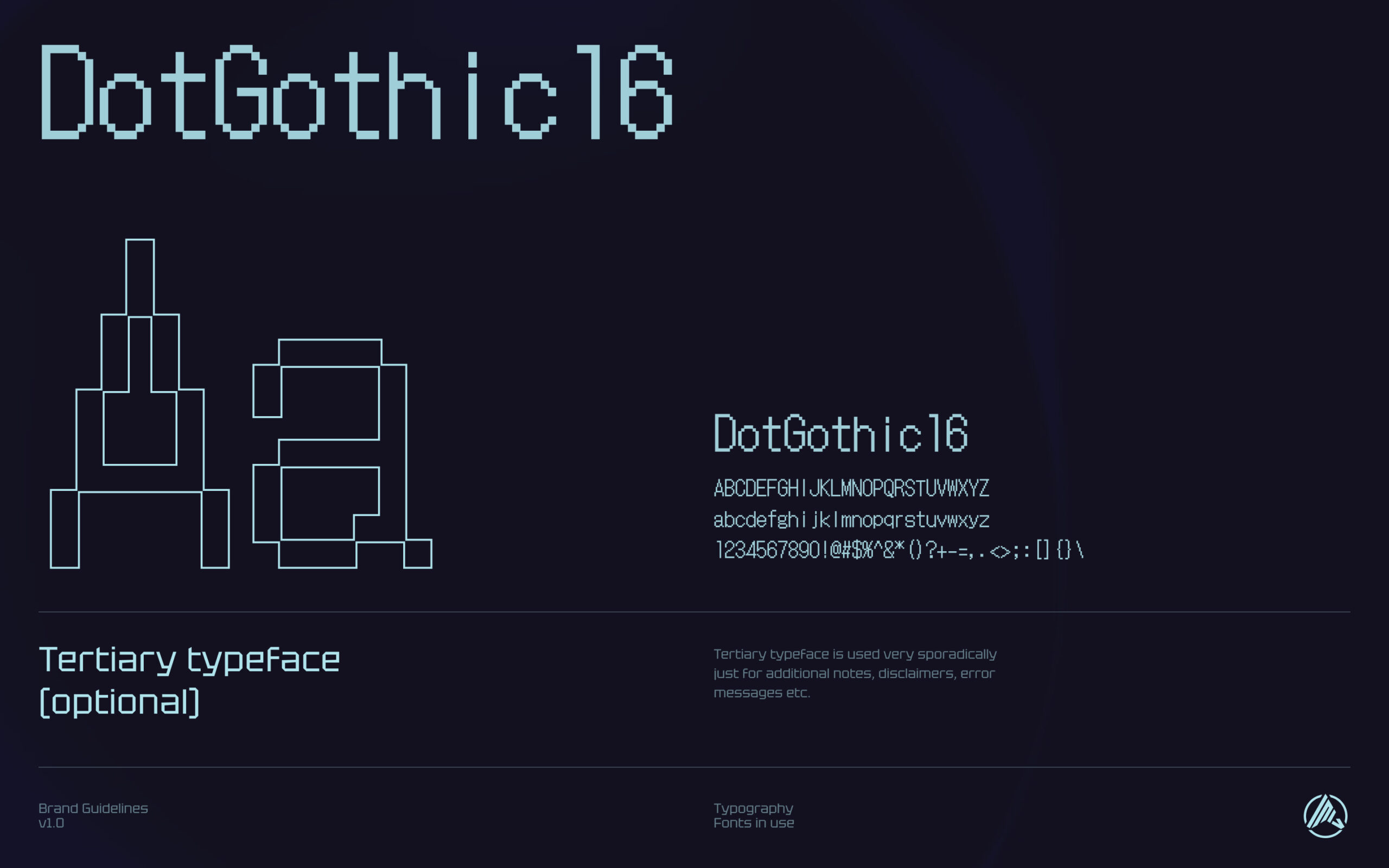
Here are few examples
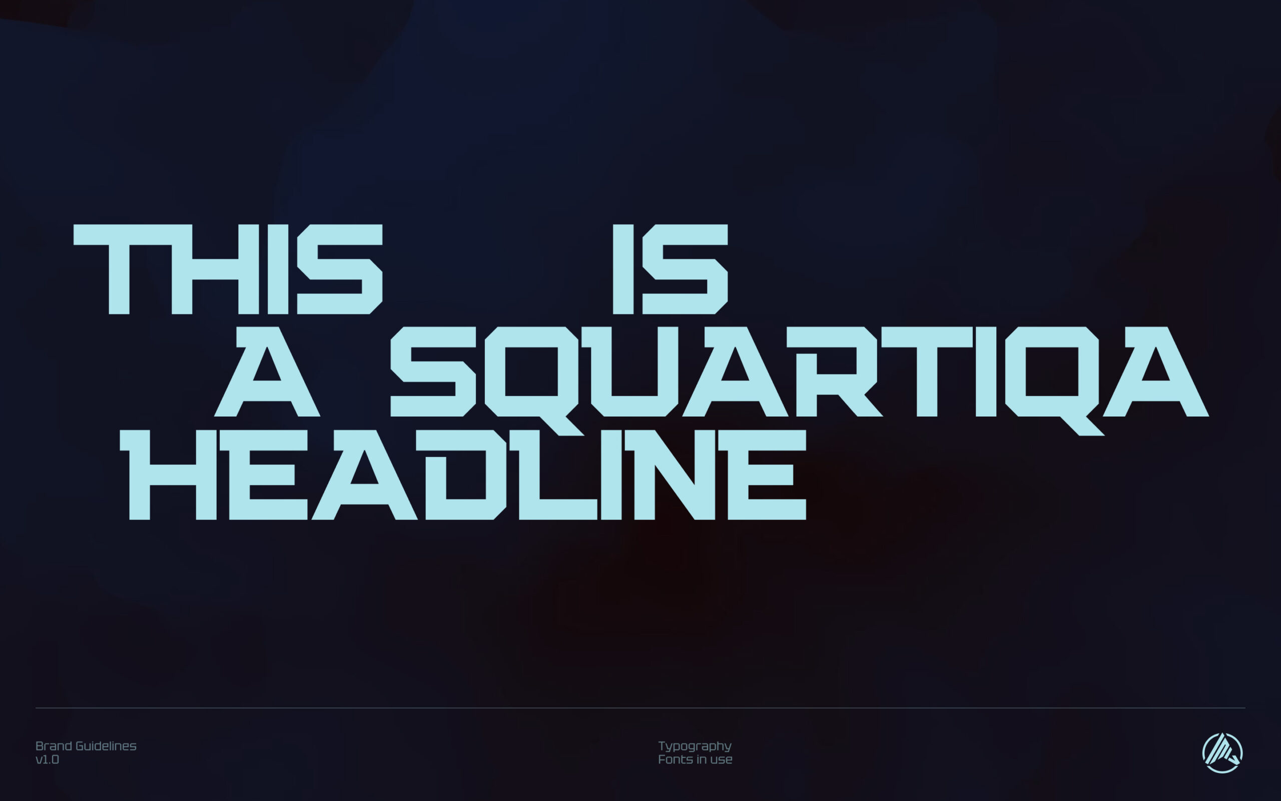
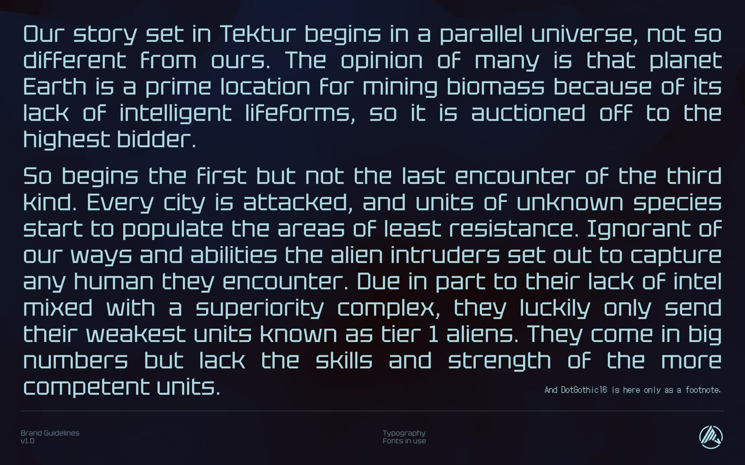
(pay attention to sizing and lengths of text for all 3 used typefaces)
[03] Colours
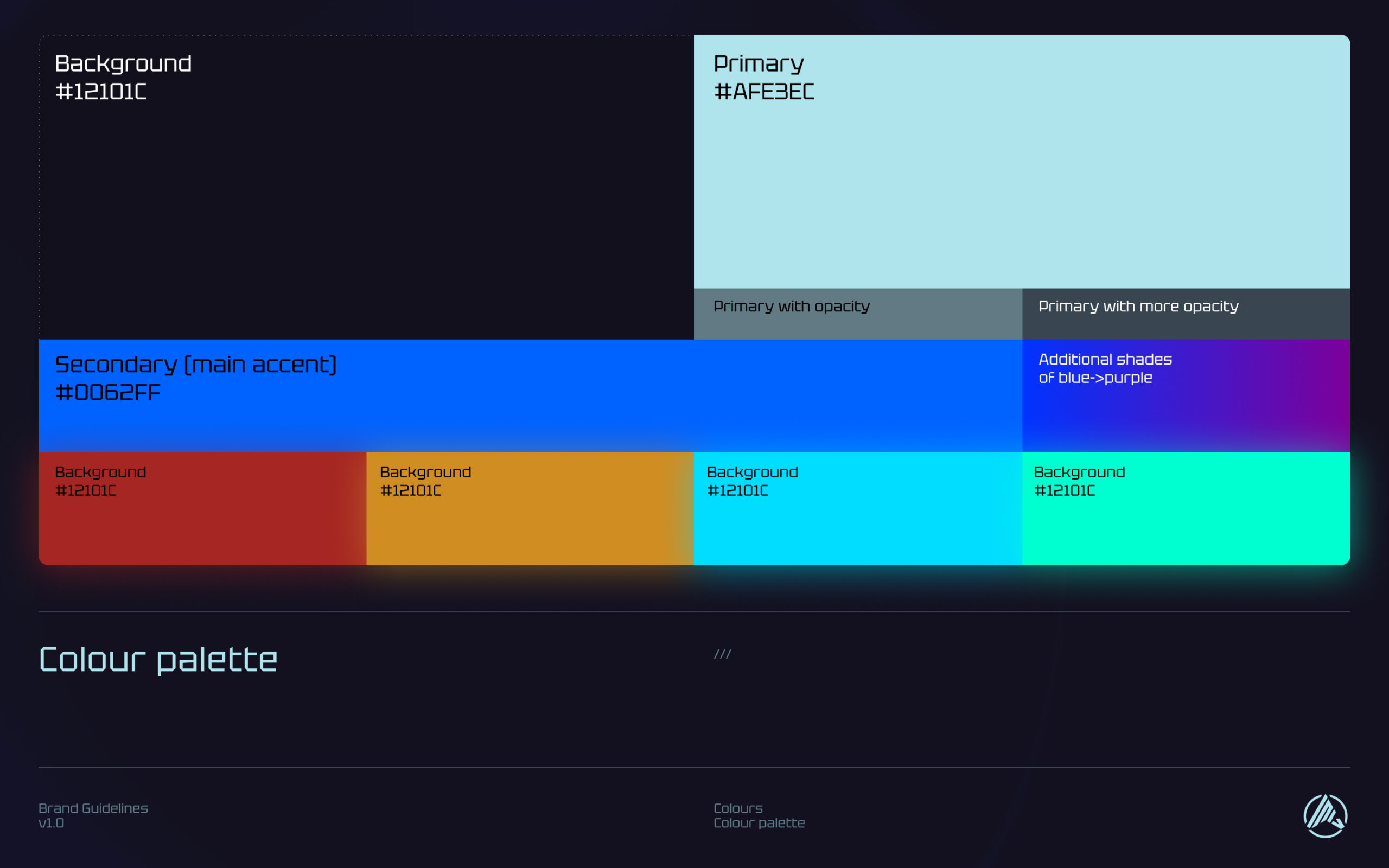
We are not too restrictive in the colours we are using. Always just make sure you get the feel for the core palette, which is inspired by GUIs from scifi franchises such as Alien, Blade Runner, Dune, Cyberpunk and more.
Once you get the basics, you can start applying other shades and colours – preferrably as "neon"/holographic accents. There is also always room to substitute the blue background with shades of purple.
When unsure, stick to the core palette – background, primary and secondary colours.
[04] Visual elements & backgrounds
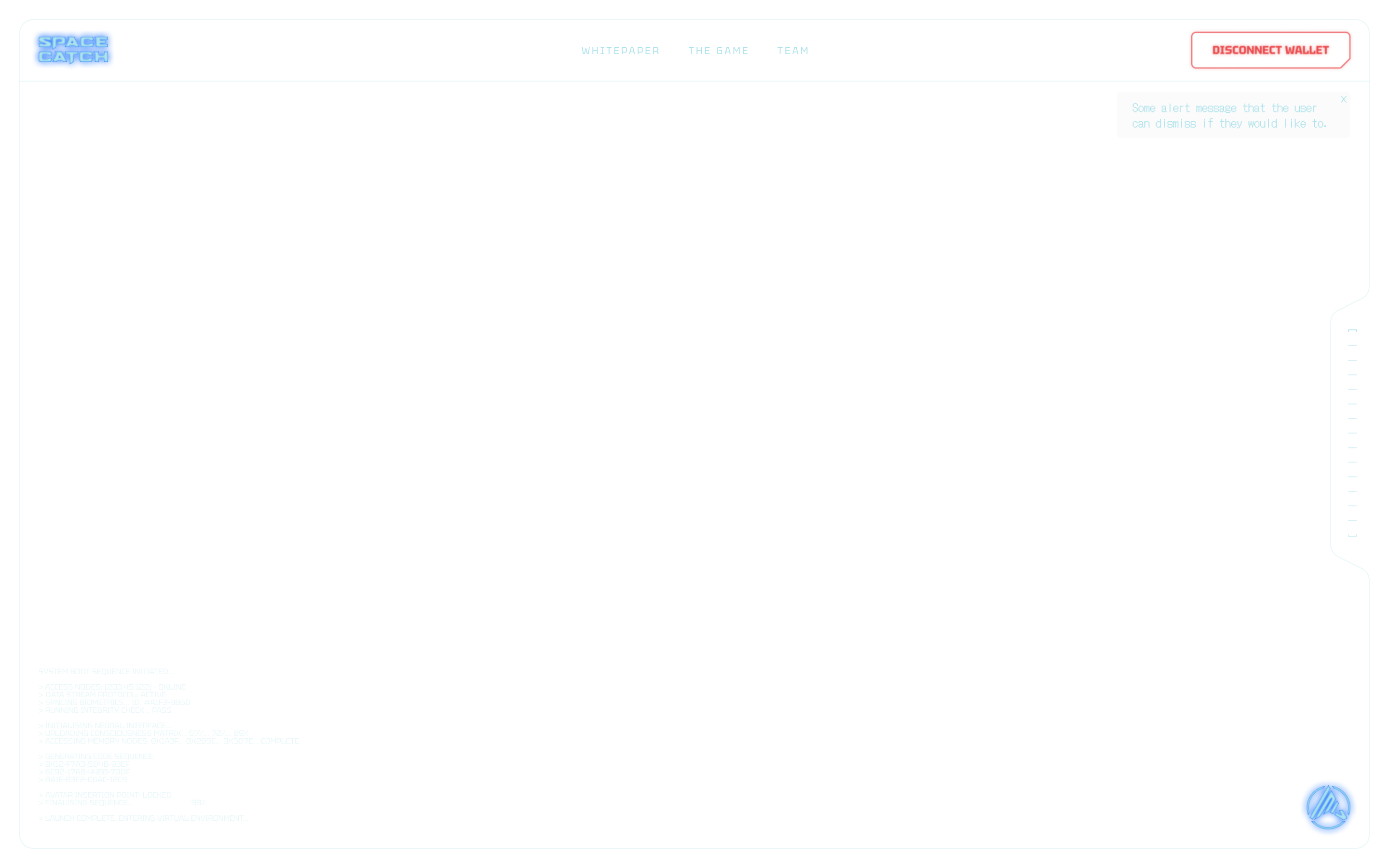
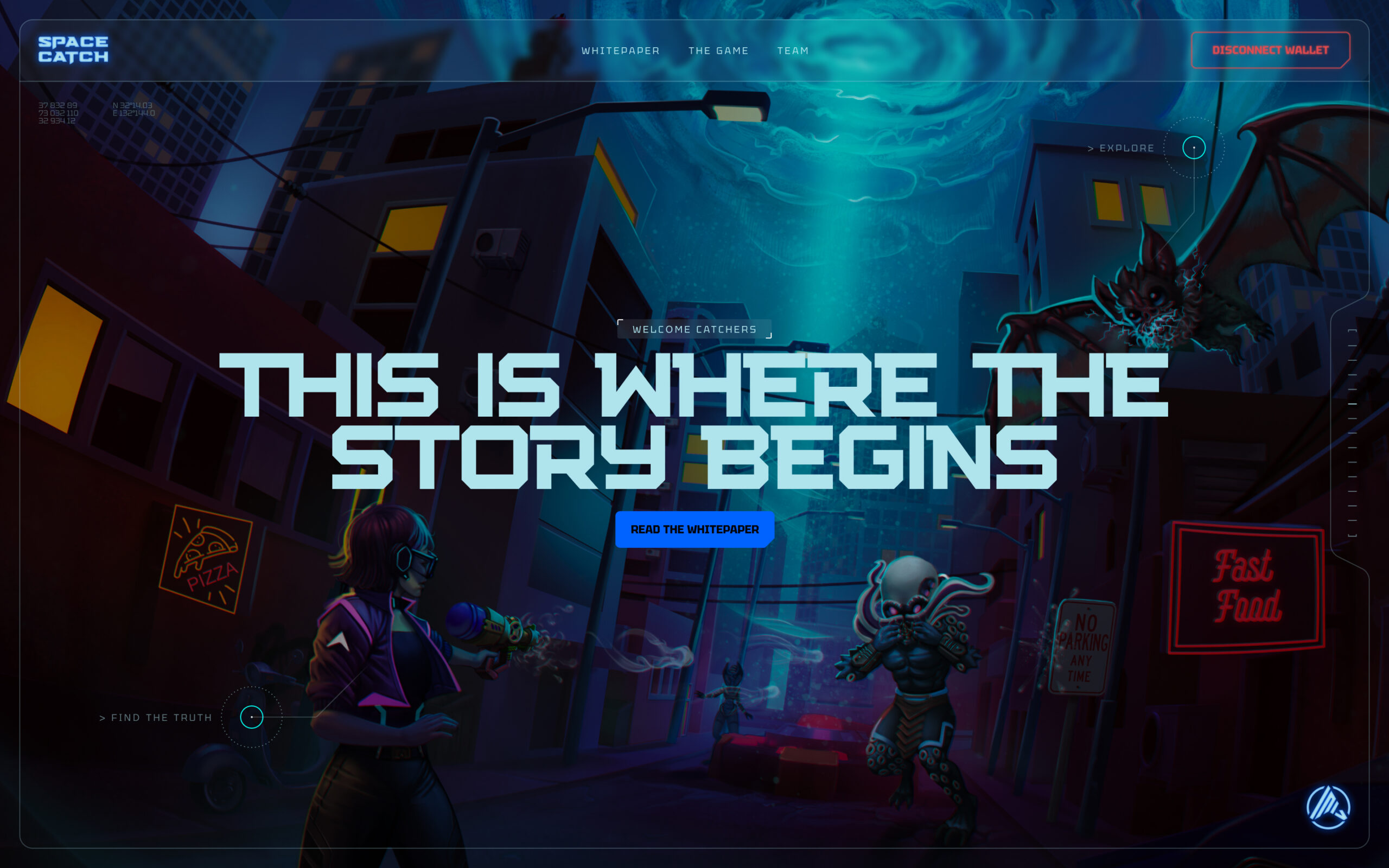
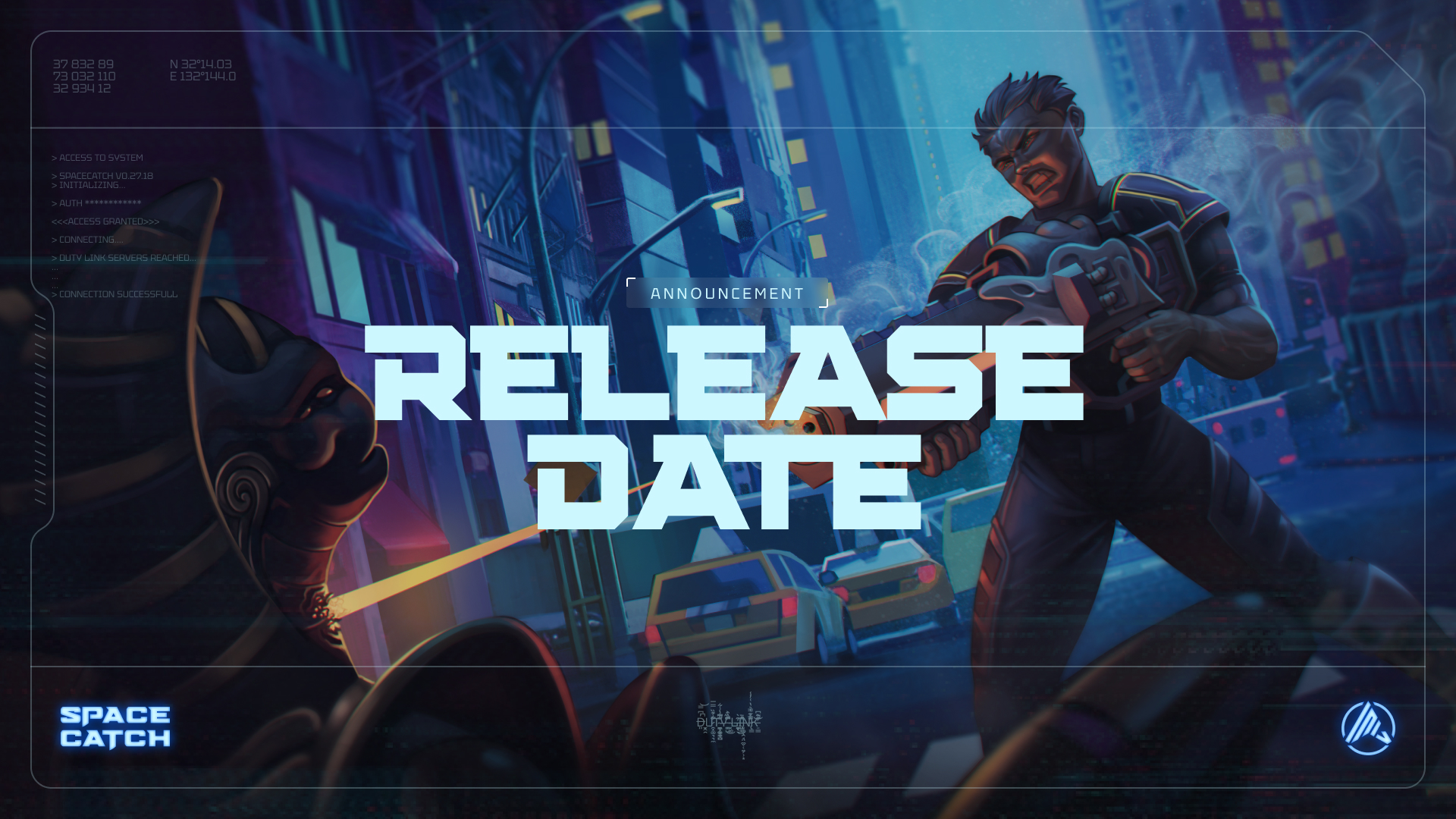
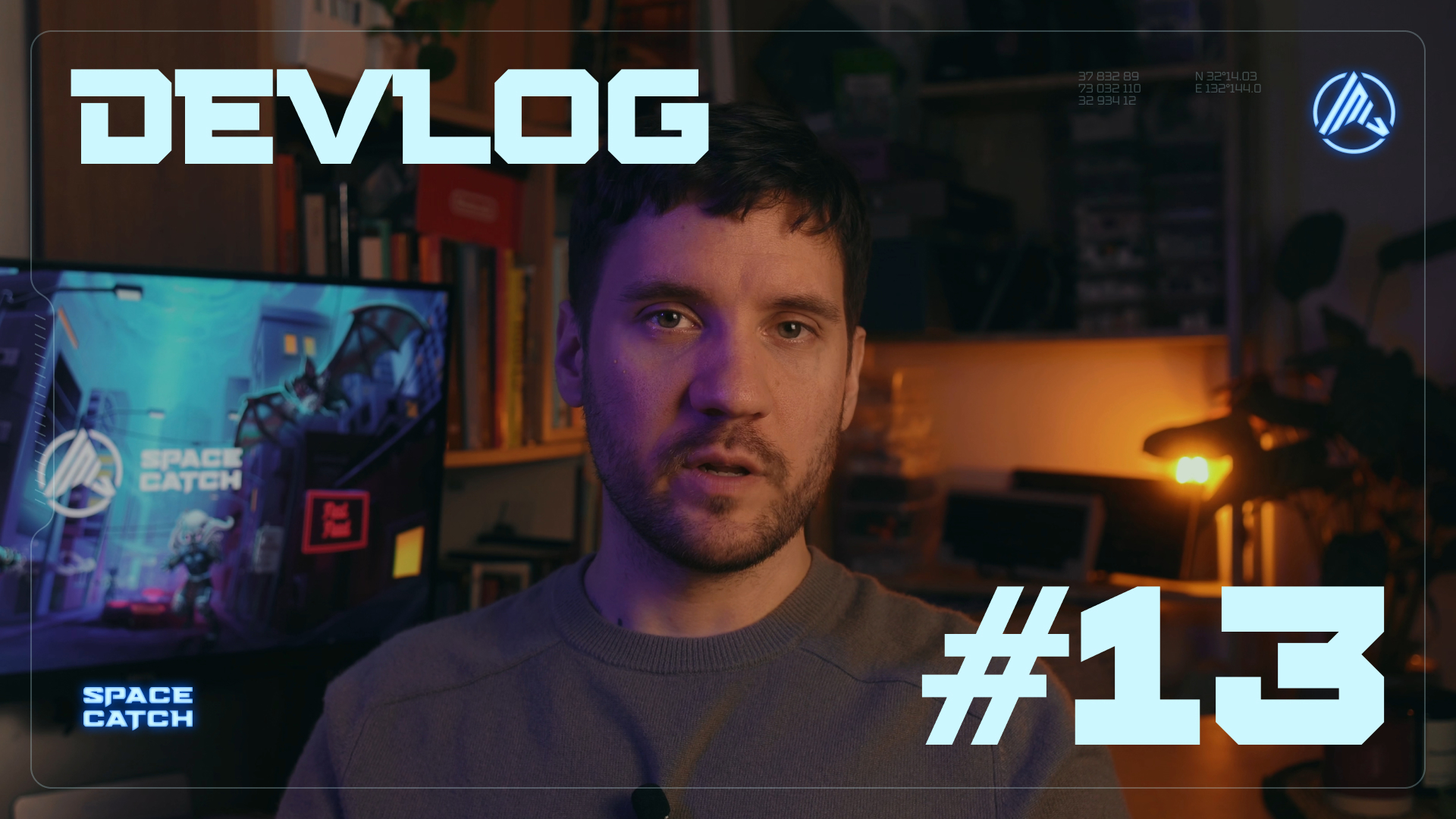
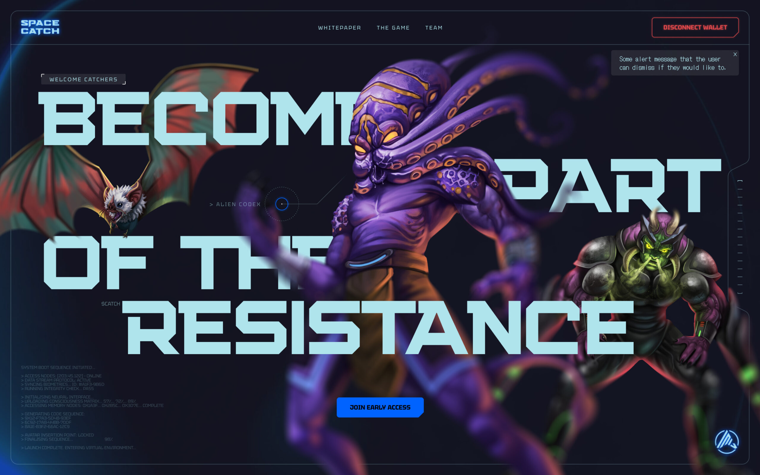
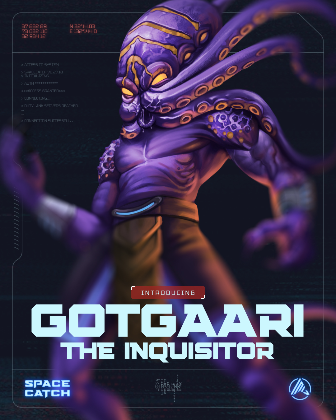
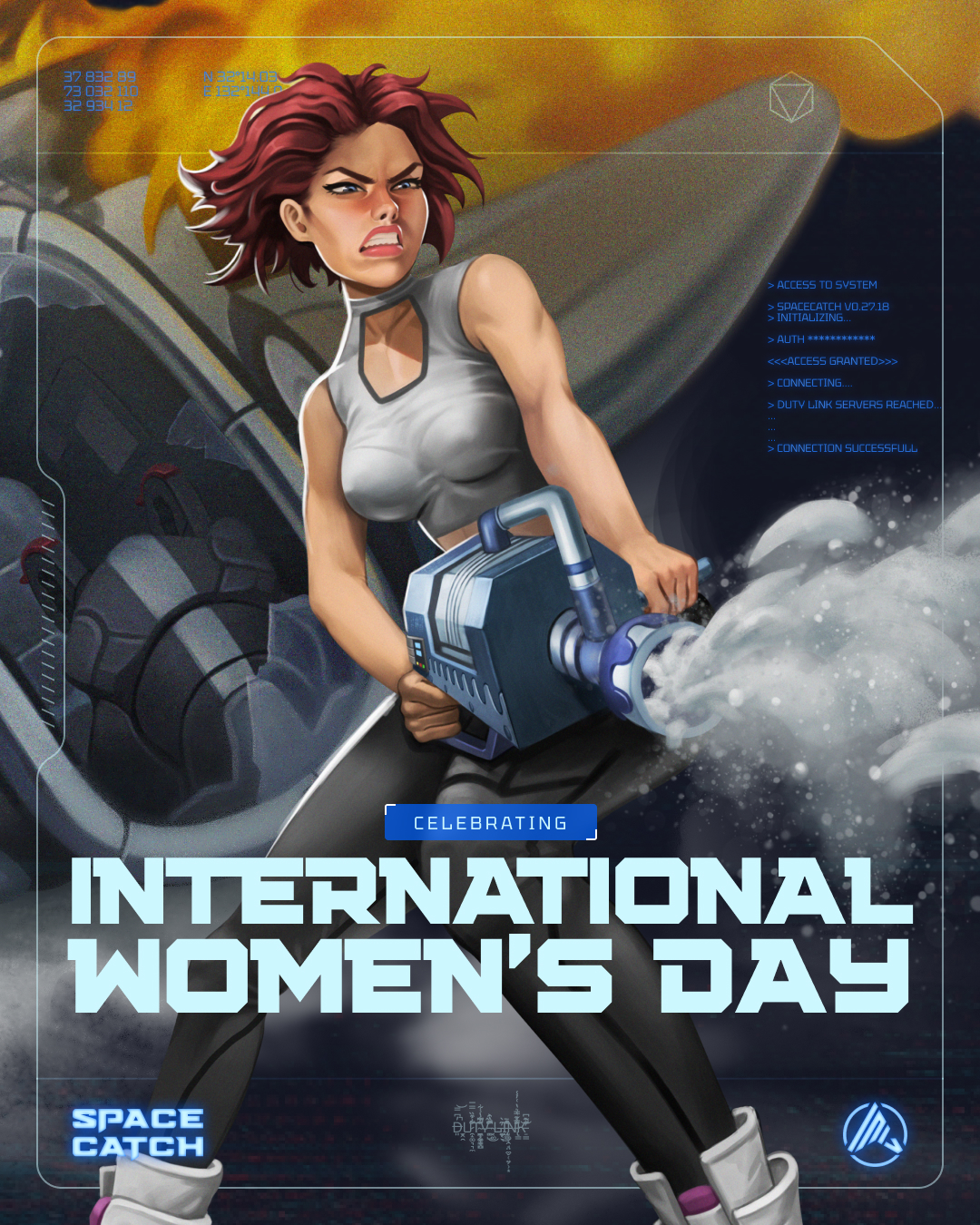
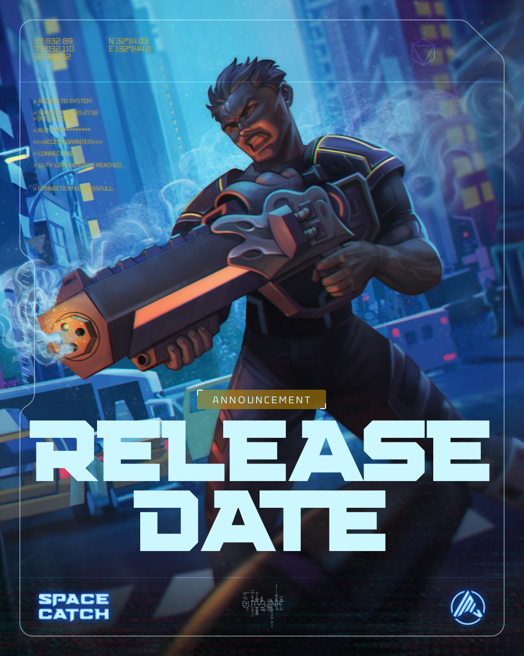
Futuristic frames, coordinates, loading sequences, glitches, hacker UI, 70s retro futurism – SpaceCatch visuals are futuristic, but full of decorative elements. Don't worry if it becomes too chaotic, the UI of the future is not minimalistic!
We use dynamic backgrounds that move as much as possible. We don't mind abstract backgrounds, anything that helps us sell the science fiction is welcome.
[05] Usage
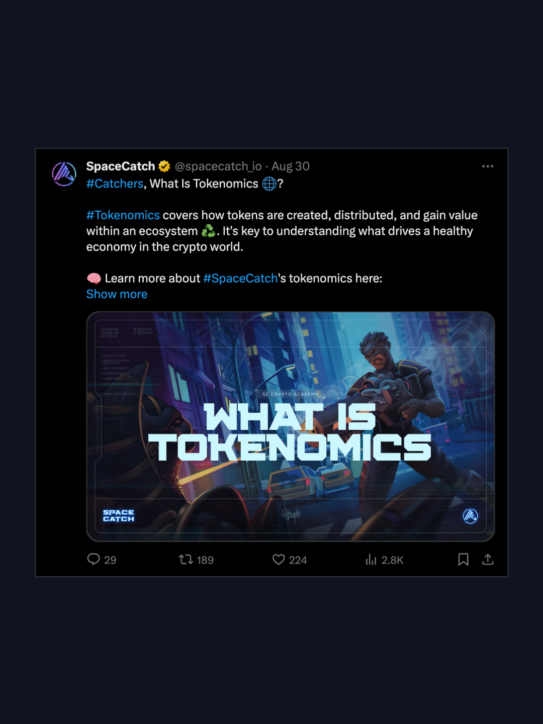
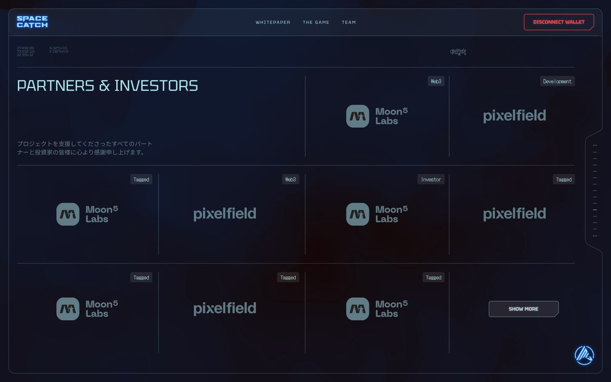
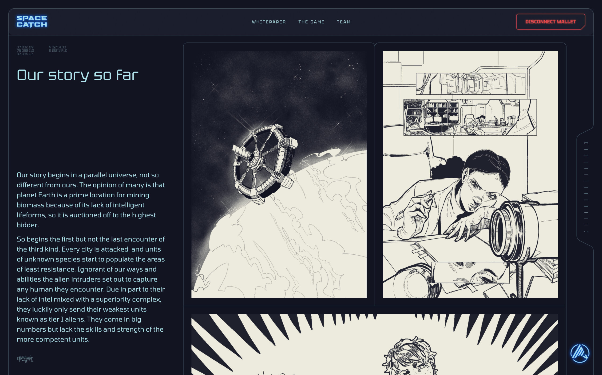
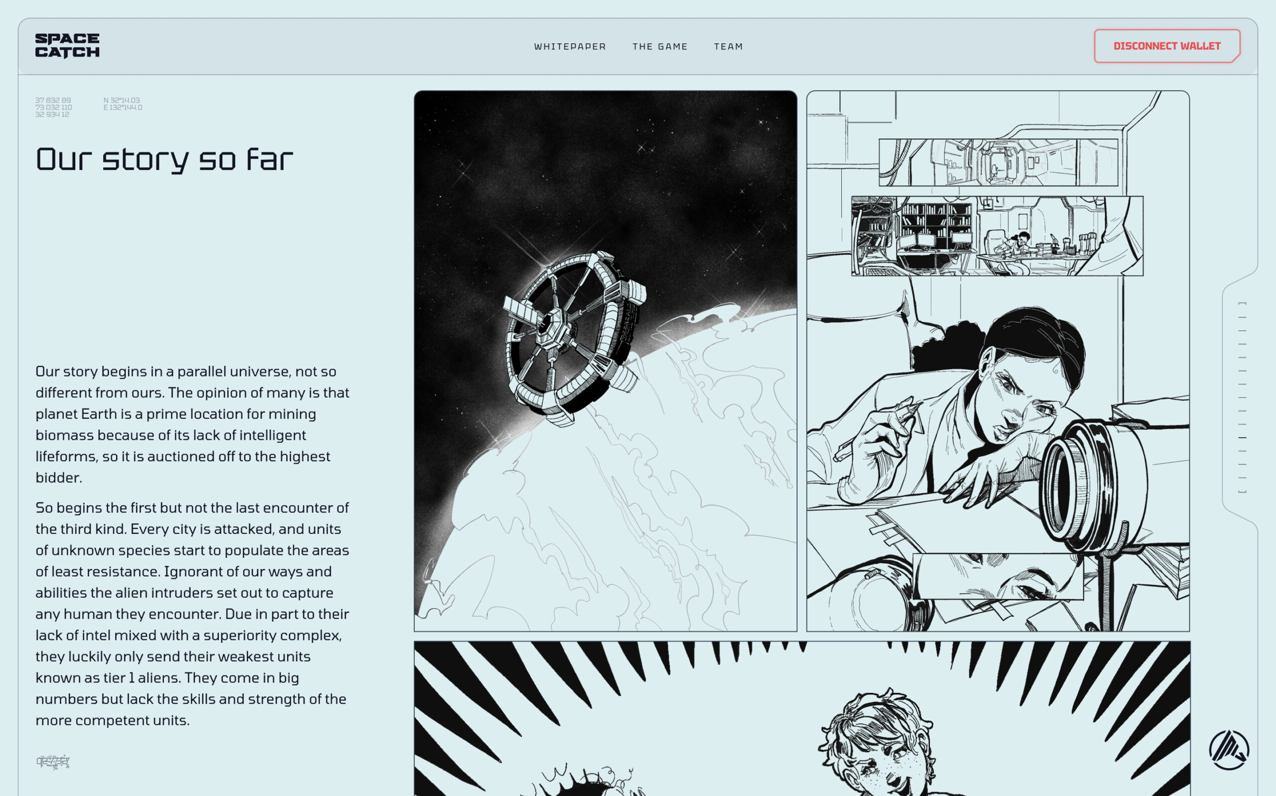
Changelog:
[1st Sep 2024] First version